Google Plus updates with huge cover photos and visual changes to profiles
Google Plus updates with huge cover photos and visual changes to profiles
Google Plus got a an update yesterday which now allows you to set a massive cover photo on your profile. The size is so huge that when you visit a profile, it occupies almost 90% of the screen space. These cover photos can be up to 2120px by 1192px in size and display in 16×9 when fully expanded. Animated gif images can also be used as cover photos adding to the fun and allowing you to be more creative.
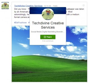
Hovering over someone’s name brings up this stylish hovercard which presents quite a bit of info about the person or page. Scrolling below the humungous cover photo on a profile, the tabs have been re-designed with a Holo-esque design which is mostly used in Android apps. “Holo” is a design theme the Android team introduced in Android 4.0 Ice Cream Sandwich. It looks like it is being applied to other Google products as well.
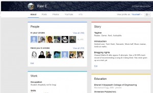
The “About” tab has gone through some changes and has separate cards for each category like work and education. This seems a little reminiscent of the current “About” section in Facebook. But Google Plus has made it much more lively with subtle highlights in colour.
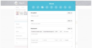
Clicking on edit under any of these cards brings up this beautiful and elegant pop-up. You can click on the circles at the top to cycle through the various categories and section available and fill up the relevant info. You can also choose with which circles which of your info is being shared or set it to public if you wish.
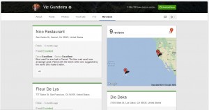
In case you have written local reviews for any places, these will show up under the new “Review” tab. Please note that this tab will not be visible if you have not written any reviews.
Overall, the redesign seems to be very slick and the use of various colour hues for different tabs and sections give it a more vibrant feel. The massive cover photos might be irksome to a few users, but the excellent community of photographers on Google Plus will find it quite useful to show case their work more easily. One of them has even shared an album of his works for users to use as their cover photos. This update has arrived right on the eve of Facebook’s big announcement which many claim to be related to a new “News Feed”. Ultimately users will decide which of these two are more striking as well as productive.
What are your impressions of the new visual changes on Google Plus? Share your views with us here.
You can connect with us here – TECHDIVINE CREATIVE SERVICES on Facebook — Twitter— LinkedIn — YourSMQ on LinkedIn — Google Plus —- Slideshare — Android App.
Related Posts:
- Google includes sign language app in Hangouts for challenged users
- Hangouts in Gmail now available in India
- Type in Hindi with Google’s Transliteration keyboard for Android
- Play Super Sync Sports using Google Chrome on your desktop and mobile
- Google Plus Sign-In ready to take on Facebook Connect
- The Chromebook Pixel from Google is here


