Facebook makes changes to re-align Timeline
Facebook makes changes to re-align Timeline
After their big announcement last week regarding the new look for the News Feed, Facebook is restructuring user profiles as well. Instead of alternatively placing posts on your profile, all posts will now follow each other in a single column. This might help you to narrow down the hunt for that elusive post you shared a week back.
All the posts that you share are now shifted into a single column on the right side of the page. This makes it quite easier to read an browse through. The photos section, Friends list, music and third party apps tab are all placed in boxes now on the left. The small thumbnails at the top for each section have been replaced with simple text tabs.
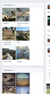
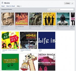
The About section now lets you add more stuff that you like in an organized manner. Friends, places, photos, music , movies are all organized into neat boxes. Apps like Instagram, Foursquare and Pinterest can also help you to share your likes, interests, places and other info to your friends. You can also choose which apps you want on your about page. For eg: If you don’t want to share the cat photos you take with Instagram you can choose to hide it from the About page.
Overall, the new Timeline looks a lot cleaner and is easier to manoeuvre around. It seems to be in synergy with the design for the News Feed that will be rolled out soon. Have you been upgraded to the new Timeline yet? Share your thoughts about these changes with us here.
You can connect with us here – TECHDIVINE CREATIVE SERVICES on Facebook — Twitter— LinkedIn — YourSMQ on LinkedIn — Google Plus —- Slideshare — Android App.
Related Posts:
- Facebook reinvents it’s News Feed
- Facebook allows voice calling in iOS mobile apps
- Facebook now allows you to promote friends posts
- Facebook launches video channel for developers


